Throwing out the kitchen sink
Design strategy・How I quadrupled email revenue for an airline with barebones email designs and a hacked A/B test.

Like many startups, Spotahome's engineering philosophy favoured speed to market and operational autonomy. This created a lot of subtly different front end designs and implementations. Differences in approach were starting to create a lot of duplication and redundancy in the front end.
When I audited deployments across the company, I found two storybooks subdivided into BFFs with subtle differences, a native app, and some 3rd party CMSs too. The squad structure roughly mapped to each application. They worked quickly but independently, accruing increasing amounts of design & tech debt.
The philosophy behind the design system is specifically tailored to Spotahome’s way of working. It’s designed to:
The primary goal of Casa was saving effort, along the whole design, build, and test cycle. We planned the build in small steps, prioritising the most common components before moving on to more complex components. This case study outlines some of the more unsual aspects of the design system.
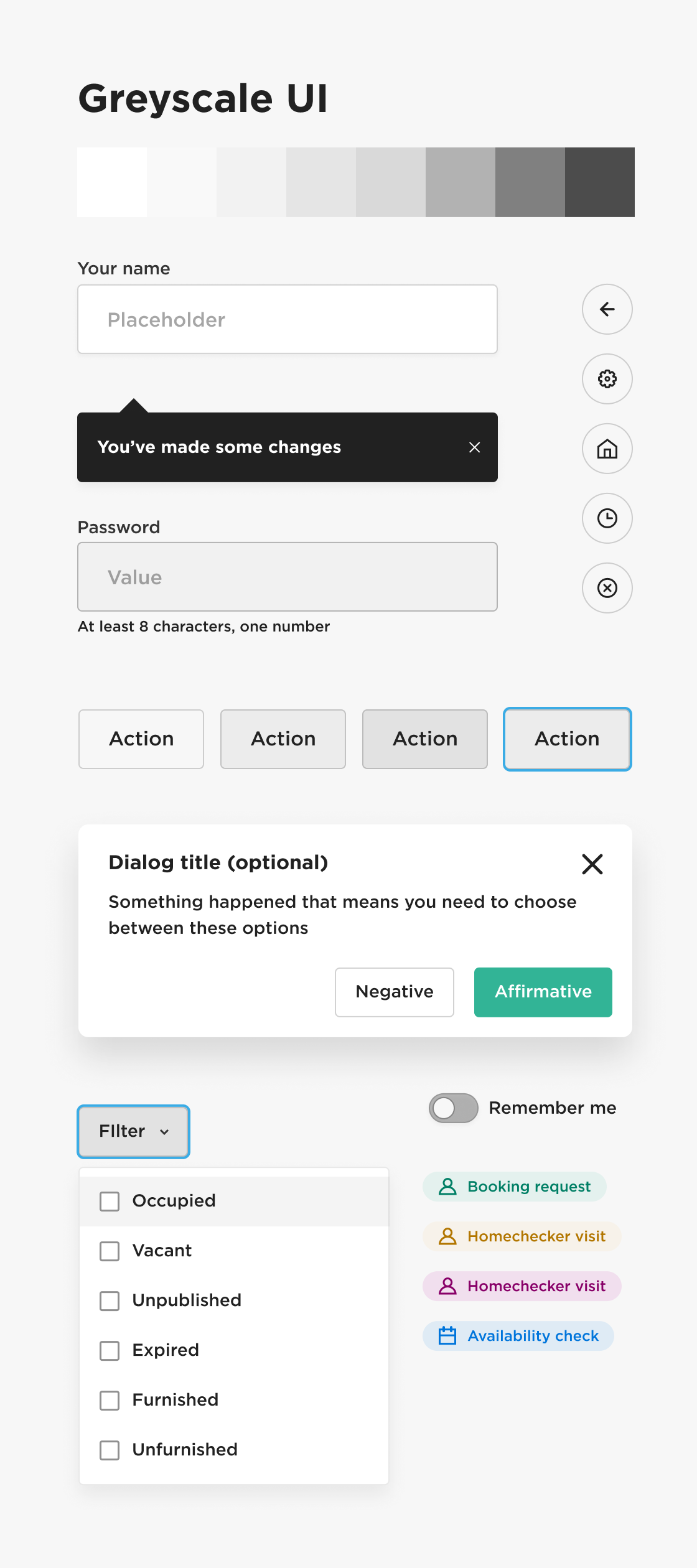
In digital music, quantisation is a method of snapping notes to the beat. We took a similar approach to creating the base styles for Casa, to make sure the system could be implemented with minimum visual disruption. After setting up the base unit grid, I audited font scales across different deployments and snapped them to base unit lengths. We could then create a new scale, and map the old class names to give the squads an easy guide for implementation.

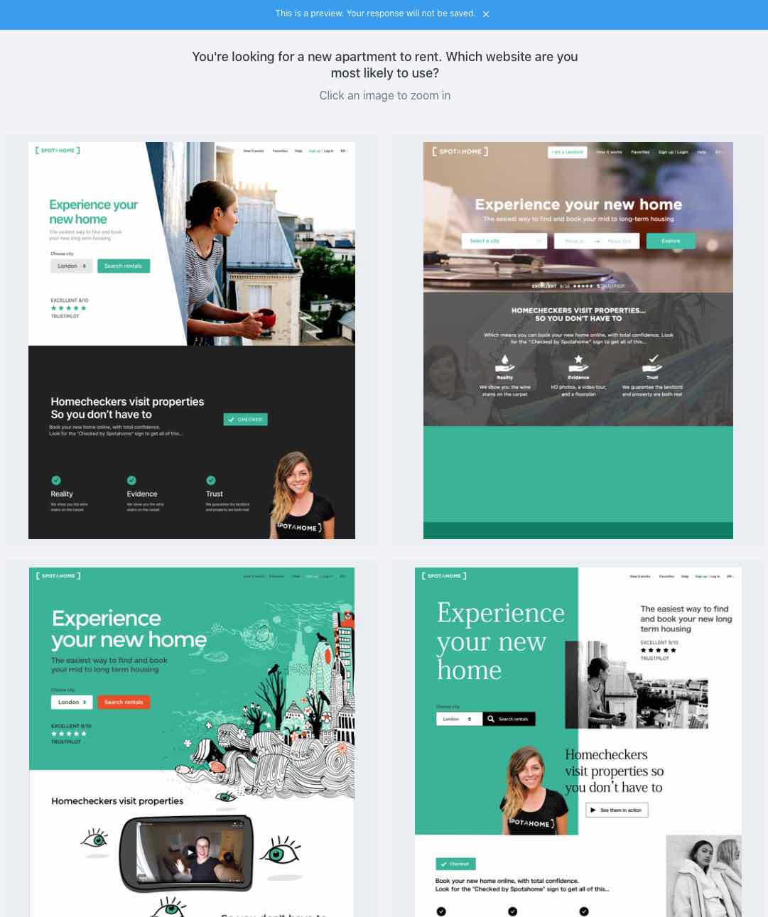
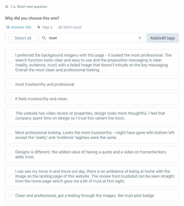
Our market was mainly students and young professionals from all over the world. My first instinct was to take a fashionable editorial route to layout, style and colour. I ran a 10-second preference test of 4 different landing page styles on 100 customers. We were surprised find the most conservative options were the most appealing. Customers cited trustworthiness as the reason for their choice. Trust became a central principle behind the aesthetic decisions in the design system.
The original brand palette for spotahome was green and white, with dark grey for blocks of neutral colour. We introduced royal blue to the palette because of it's overtones of calm authority and trust. As we worked through landing page designs, we began to wonder if the colour could replace black in the palette. Using black in transparent UI elements desaturates underlying colours. Blue is a natural shadow colour. Bluescale gave a subtle but pleasing personality to drop shadows, neutral buttons, icons and text.

Want to work with me to create amazing products? Let's chat
Design strategy・How I quadrupled email revenue for an airline with barebones email designs and a hacked A/B test.
Design ops・How we made design work in mixed discipline teams when we were short on headcount.